
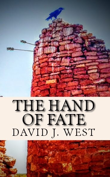
Here is the cover for my book, Heroes of the Fallen. I have the tentative release date of around October 15th, but that might even get moved up a hair. You can click on the picture on my sidebar to pre-order from Amazon, which is cool if you're so inclined but I would like it if anybody local could come to a signing when the time comes. I've been arranging things with Borders and Barnes and Nobles, so it's an awesome feeling to think I will be available within some of my favorite haunts. And I also know my publisher is working toward getting me into Deseret Book as well.


25 comments:
What a cool concept to do the shadows in front of the rocks. I also really like the font the artist chose. What's her name again? I want to watch for her web site. :)
You must be so STOKED!! It looks SO good, David. I can't wait to buy it and read it! How exciting!! You'll have to tell us if it gets placed with Deseret Book so I can decide whether to support Amazon or Deseret. Will it be available through Target.com like Ghost Waves?
And how exciting that your book will be at Barnes and Noble and Borders. Are you arranging to do a signing at one of those stores??
Cool! Isn't it an amazing feeling to see your cover and realize it's not totally lame?
David, that is so awesome. I simply love the cover. I'll be buying, of course. are you going to do a book signing back east???
I'll be asking for your advice on approaching Barnes and Noble when the time comes. I'm nervous about it. Let me know how it goes w/ Deseret Book!
That looks pretty cool -- and unique enough it should stand out well at the bookstore. Congrats!
Rock on, David, I am very excited by this!
.
Hhoo. Feel free to delete this comment if you want to keep the love flowing, but don't forget what I'm saying because although I'm much more critical, it's still love. I love you enough to say that this cover is, well, not that great. IMHO, of course.
Here are the problems as I see them:
1. This type of low-end rendering screams selfpub/smallpress, and anything that gives people a sense of less professionalism is to be avoided. I agree that the concept is good. But rather than a few hours with a CPU, why not get you and a friend dressed up in your gear and take an actual photo of actual shadows? A good photograph will work a thousand times better than what you have here.
2. The font is okay, but the way in which it has been aged has all the same problems I mentioned in #1. It looks like a computer did it (c. 1995). And yes, this is 2009, but we still want things to look real. Obviously computer-generated effects are a turnoff for most people.
3. The box around the title is a cliche that wasn't even good when it was born. Fading the background ever so slightly and placing the text on top? No. Absolutely not. And what's with the "stone" border? I've never seen a granite picture frame in my life.
But this is not an utter failure. If you told me this was a thumbnail or a mockup, I would say great! This gets a sense of your book across, shows the reader how your book differs from others in the genre, etc etc etc. All good things. But the execution is lacking. Your book is gritty and real. It shouldn't look like it's set in World of Warcraft.
My advice then: Get a real photograph. Get a better type treatment. Then you'll be set.
Good luck!
Congrats on your book coming out. Suzette told me a little about it and it sounds really interesting. I'll be excited to read it!
Wow, Th, that was really harsh, uncalled for to post publicly, and if you really cared, you would have sent him a private message. Plus you're way off base in your analysis, imho.
AND, btw, photography makes lame covers, IMHO, of course.
.
My original plan was to email him, but then it occurred to me that David would probably prefer that people feel like they can offer an honest analysis and if my "harsh" opinion freed readers from just saying Yay! whether they felt it or not, I figured that was good for the dialogue. And I don't think David is very apt to take my opinion as a personal attack. I'm looking forward to reading his book already. The cover's job is to draw in people who aren't already sold.
And photography can be lame, for sure. The real issue is professionalism. A cover should look professional. A bad photograph is no better than bad CG. I will agree with that.
I have to agree with Th. I wouldn't have said anything because I can't give the same details he can, but it does seem amateurish to me.
Karen, actually, I think some of your postings and such come off very harsh and, worse, without the correct information to back it up. I suppose "harsh" is all in the eye of the reader.
I want David to do well because the marketplace deserves concepts like his and original spins on old themes. Many, many an author's career has been derailed (temporarily or permanently) by a bad cover--which is almost NEVER in the hands of the author (which is unfortunate).
(And say what you like about mine [FWIW, Th. doesn't like it, either], but it looks professional and gets people to pick up the book. The blurb does the rest. And THAT, my dears, is exactly what you want.)
I have no eye for art, so I can't tell you if it's good or not. But this cover would probably attract me enough that I would pick it up just to see what it's about. However, it would be the blurb along with reading a few pages that would convince me to buy the book, or not.
But whether the art is "good" or not, it must still be an exciting feeling to see that your book is actually being published and that there's something physical there that you can show other people!
I don't think Th.'s comment was harsh or uncalled for. When I post my writing on the internet, I always call for any criticism, constructive or not, and I'm quite willing to have those comments out in the open where everybody can read them. On the other hand, I can always go back and change something according to what my readers say, but this cover is out of David's hands. Still, Th. did point out that he was telling the truth (as he saw it) out of love, and I don't think he did it in a way that anybody should feel attacked. I myself was quite fascinated by the points that he made ... but then, it's not my work. *shrug*
Just my two cents on the issue.
but this cover is out of David's hands.
Yes. And again, IMO, unfortunate. I hope that he doesn't perceive that this is criticism of HIM or his work, because it's not.
I'll be picking up the book regardless just because I'm so hungry for something different in LDS fiction.
While I understand that Th was giving his opinion out of love, I really think it is something you should have been more private about. This is not something that should be debated on David's blog for everyone to see. If you have a "humble opinion" about his cover, keep it between the two of you. Please, show a little respect to him. And remember what it felt like your first time. I'm sure he can handle criticsm, but this was just unnecessary.
Ok.
This has got to be the most traffic my blog has ever got in the 12 odd hours or so since I posted something, so I hope thats good. I sure wouldn't mind pre-orders unless you are close by the wasatch (then come and meet me in stores). I will be doing a bit of out of towning but don't believe I will make it to California or out east yet. Probably just up and down the Rockies for now.
lol David, you are sure getting the publicity!
For that reason alone, I'm sure David doesn't mind the debate. Let it draw in the crowds!
I'm not an artist. I looked at that cover, and thought, "Wow!" It looks classy. It doesn't have a lot of color, just a good amount of contrast. I *know* it's computer generated, and that so doesn't bother me. I love the look.It reads "professional" to me. I'm a layman. If it looks that way to me, I expect it will to most people.
Of course, David, I will buy it no matter what the cover looks like. I also know that WiDo gets the author's input on the cover. I hope that you are happy with how it turned out. I *love* it. I think it's my favorite cover by WiDo so far.
Call me all kinds of names...and then come to my blog and increase traffic.
This isn't even the controversy I am expecting. Just wait until the FARMS people come after me for historical inaccuracies.
David, let me just say, Congratulations (since only one other person actually did). This is a wonderful accomplishment and it must feel absolutely amazing to be at this point in the process. Can't wait to be there myself.
Critic comments and arguements aside, I think the cover is fine. I like the font, and think the shadowed rocks are creative as far as covers go. I think some people forget that beautiful art is in the eye of the person who is looking. It does draw the eye, and the title alone is catchy enough to draw interest, regardless of who likes or doesn't like the cover.
So, again, I say congratulations and I'm so excited to get my signed copy!
Thanks Nichole, now about nominating me for a Whitney . . .
.
I just realized what / would like your cover to be (were it up to me): the image you have at the top of your blog. That would be perfect.
I'm still not sure where Kim V. got that from so I have no idea about possible rights. Cest Lavie
.
It's a great image.
Hi David, I just wanted to say congratulations for what most of us don't have the courage, fortitude, and discipline to do--write a book. You should be damned proud. It looks great.
Thanks Brian, you ought to be getting the ARC in about a month.
Congrats - it's all really happening, eh? Must feel so surreal.
Post a Comment